Visualizing the target estimand in comparative effectiveness studies with multiple treatments
Publication: Journal of Comparative Effectiveness Research
Abstract
Aim: Comparative effectiveness research using real-world data often involves pairwise propensity score matching to adjust for confounding bias. We show that corresponding treatment effect estimates may have limited external validity, and propose two visualization tools to clarify the target estimand. Materials & methods: We conduct a simulation study to demonstrate, with bivariate ellipses and joy plots, that differences in covariate distributions across treatment groups may affect the external validity of treatment effect estimates. We showcase how these visualization tools can facilitate the interpretation of target estimands in a case study comparing the effectiveness of teriflunomide (TERI), dimethyl fumarate (DMF) and natalizumab (NAT) on manual dexterity in patients with multiple sclerosis. Results: In the simulation study, estimates of the treatment effect greatly differed depending on the target population. For example, when comparing treatment B with C, the estimated treatment effect (and respective standard error) varied from -0.27 (0.03) to -0.37 (0.04) in the type of patients initially receiving treatment B and C, respectively. Visualization of the matched samples revealed that covariate distributions vary for each comparison and cannot be used to target one common treatment effect for the three treatment comparisons. In the case study, the bivariate distribution of age and disease duration varied across the population of patients receiving TERI, DMF or NAT. Although results suggest that DMF and NAT improve manual dexterity at 1 year compared with TERI, the effectiveness of DMF versus NAT differs depending on which target estimand is used. Conclusion: Visualization tools may help to clarify the target population in comparative effectiveness studies and resolve ambiguity about the interpretation of estimated treatment effects.
Tweetable abstract
#Visualization of the target #Estimand helps to interpret the generalizability of comparative effectiveness results in real-world evidence studies. Read our paper to find out more!
Plain language summary: An accessible way to visualize to whom study results apply when the benefits of multiple treatments are compared
What is this article about?
A patient with a chronic disease such as multiple sclerosis often faces multiple options for treatment, which is why studies comparing more than 2 treatments are frequent yet harder to conduct. This is because when comparing only 2 treatments at a time and attempting to draw conclusions about all treatment options, there is a risk of mixing oranges with apples; a comparison of treatments A and B may apply to a certain group of patients while one comparing treatments A and C applies to another group with different characteristics, such as age or clinical values. In this article, we first help the readers understand the impact of this problem by using simple visualizations. Then, how to face this situation and understand which patients will benefit from the findings of such study? We use the same visualization tools to help clarify which patients are concerned with the results from a study.
What were the results?
First, we create artificial data using established statistical techniques and use two visualizations to showcase how the group of patients to whom study results apply changes according to which treatments (A and B, or A and C) are compared. This first part is what we call a toy example, because we create data simply to help the reader understand the problem and explain how to use the visualizations. Second, we use the same visualizations to tackle a real research problem: how do teriflunomide (TERI), dimethyl fumarate (DMF) and natalizumab (NAT) affect manual dexterity in patients with multiple sclerosis? We find that, depending on whether TERI and DMF, TERI and NAT, or DMF and NAT are compared, the results in terms of manual dexterity apply to patients of different ages and disease durations. In particular, we find that DMF and NAT improve manual dexterity compared with TERI overall, but that conclusions between DMF and NAT differ depending on what group of patients are considered in the analysis.
What do the results of the study mean?
The results of this article provide value to researchers and patients in two ways: (1) they help understand a difficult and often imperceptible problem relative to interpreting study findings when comparing multiple treatments and (2) they show how simple visualizations can be used to clarify to whom results about the benefit of different treatment options apply. If all researchers were to use the visualizations in their own study, results about the comparison of different treatment options in the medical literature would be easier to interpret and to connect with other studies, ultimately helping patients and clinicians better treat diseases.
Real-world data sources are used increasingly often to compare all available treatments in real-life settings [1,2]. Unfortunately, they are notoriously prone to confounding bias, which arises when individual characteristics affect the outcome and the treatment assignment. The presence of confounding is often addressed by conducting a propensity score (PS) analysis [3–5]. This approach aims to restore balance in the distribution of covariates of the treatment groups being compared and reduces bias arising from observed confounders [6–9]. While PS-based methods were originally introduced in the context of comparison of two treatments, they can also be used for comparisons of multiple treatments [10,11].
A key issue in PS analysis is that its implementation affects the target population of statistical inference and may thereby distort the interpretation of treatment effect estimates. For example, the comparative effectiveness between alemtuzumab with interferon beta, fingolimod, and natalizumab was previously assessed in an observational study including patients with relapsing-remitting multiple sclerosis (RRMS) [12]. In this study, the treatment effects were estimated separately for each comparison in three matched samples (i.e., one for each comparison). Although the PS analysis improved balance of confounder distributions within the matched samples, no efforts were made to preserve balance between the matched samples. Consequently, the estimated treatment effects could not directly be compared due to a lack of transitivity. This discrepancy becomes particularly relevant when the treatment effect varies across subgroups or is modified by patient-level covariates [13]. It is therefore essential for observational studies adopting PS analysis to provide a clear description of the weighting scheme and the population being targeted [14].
To enhance the interpretation of treatment effect estimates, the International Council for Harmonisation of Technical Requirements for Pharmaceuticals for Human Use (ICH) published the E9(R1) addendum on estimands and sensitivity analyses in clinical trials [15]. The estimand framework requires researchers to explicitly define the conceptual clinical question of interest in a formal causal quantity that is the target of the analysis [16]. Briefly, this involves specification of five key attributes: the treatment condition of interest, the population of patients targeted by the clinical question, the end point variable, the definition of intercurrent events, and the population-level summary measure. The estimand framework has recently been incorporated in guidelines for the analysis of randomized clinical trials by the US FDA [17] and the European Medicines Agency [18]. Several authors have suggested that the estimand framework could also improve the conduct and quality of reporting of observational comparative effectiveness studies [14,19,20], particularly since their results are notoriously prone to bias, ambiguity [21] and heterogeneity [22].
The objective of this research is to demonstrate that visualization tools can be used to clarify the target population in comparative effectiveness studies and thereby facilitate proper interpretation of their results. Visualization tools have previously been used to illustrate the impact of incorporating external control data in randomized trials [23], and to describe the intersection of multiple treatment groups [24]. In this manuscript, we use visualization tools to illustrate the non-transitivity of treatment effects when using pairwise 1:1 nearest neighbor PS matching, an approach that is commonly used to address confounding bias. Although it is possible to avoid transitivity problems by adopting 1:1:1 matching or weighting methods [24–30], a clear understanding of the target population remains critical.
We first conduct a simulation study to demonstrate transitivity fallacies that may arise when conducting multiple treatment comparisons. Subsequently, we use a case study to illustrate how visualization of the underlying populations can be used as a diagnostic tool for defining the target estimand.
Materials & methods
Defining the population attribute
Observational comparative effectiveness studies usually target the average treatment effect (ATE) or the ATE among the treated (ATT), which capture different populations.
The ATE is the average individual-level treatment effect across all individuals in a population. For example, consider adults diagnosed with RRMS who are treated with treatment A, B or C. The entire population is then represented by the union of the treatment-specific covariate distributions (Figure 1i). Estimates of the ATE are transitive across all subpopulations AB (i.e., patients receiving A or B), AC, and BC because the target population is identical for all these treatment comparisons.

Figure 1. Conceptual illustration of the bivariate covariate space for three treatments A (green), B (orange) and C (purple).
Various target populations are illustrated for comparing three treatments with shaded gray areas: (i) the entire population, (ii) the population of individuals that are eligible to receive A, (iii) the population of individuals that are eligible to receive B, (iv) the population of individuals resembling those who received B and are eligible to receive A, (v) the population of individuals resembling those who received C and are eligible to receive A, and (vi) the population of individuals that are eligible to receive all three treatments A, B, and C.
The ATT is the average individual-level treatment effect in the population of individuals resembling those who received a particular treatment. Multiple ATTs can be defined depending on which treatment is used to define the target population. For example, when comparing two treatments A and B, the average treatment effect can be estimated for individuals resembling those treated with A (henceforth ATT-A; Figure 1ii) or with B (ATT-B; Figure 1iii). The ATT is often estimated separately for each treatment comparison using pairwise PS matching. As illustrated in Figure 1iv & v, the target population of pairwise PS matching does not necessarily coincide with the population of treated individuals. For example, when conducting a pairwise comparison between treatments A and B, matched samples for estimating the ATT-A are restricted to individuals eligible to receive treatment A. This implies that for pairwise AB comparisons, the ATT-A does not consider individuals who received treatment C but have a propensity of receiving treatment A. Similarly, for pairwise AC comparisons, the ATT-A does not consider individuals who received treatment B but are eligible of receiving A. More generally, the case-mix of matched samples is driven by the characteristics of the treated individuals and may differ across treatment comparisons. Estimates of the ATT are not transitive, unless their populations are identical in terms of covariate distribution, or unless the treatment effect is identical across all levels of covariates [13]. Estimates of the ATT are therefore prone to external validity bias when the study and target population differ in their distribution of effect modifiers [31].
Visualizing the target population
Based on the work of Lopez and Gutman, we propose two visualization tools to inspect discrepancies in the covariate distribution across different pairwise comparisons [24]. These tools can be used to clarify the target population of each comparison, to assess their degree of overlap, and to determine whether corresponding treatment effect estimates are transitive. The first tool is based on Euler diagrams and adopts bivariate ellipses to visualize the joint distribution of two (semi-)continuous covariates [24]. The second tool is a so-called ‘joy plot’ that visualizes multiple density (for continuous variables) or bar plots (for categorical variables).
Simulation study
Methods
We created a toy example by simulating a single super-population of n = 120,000 individuals with two continuous covariates that affect the administration of one of three possible treatments (A, B or C). We generated a continuous outcome that is affected by the two covariates and the treatment choice. Subsequently, we used 1:1 PS nearest-neighbour matching with replacement to estimate the ATT for each pairwise comparison and for each target population. This resulted in two matched samples targeting the ATT-A (i.e., for comparisons AB and AC), two matched samples targeting the ATT-B (for comparisons AB and BC), and two matched samples targeting the ATT-C (for comparisons AC and BC). Each matched sample was analysed using a linear regression model with the treatment indicator as only independent variable, resulting in six estimates of the ATT. We then visually assessed the transitivity of the treatment effect estimates by comparing the target populations before and after matching for all pairwise treatment comparisons. All R code is available from https://github.com/smartdata-analysis-and-statistics/visualization-estimands.
Results
The plot in Figure 2 depicts the joint distribution of the two covariates by treatment group. The three populations of treated individuals have an overlap of roughly 50%, corresponding to values of x1 and x2 between -2 and 2. Low or high values of x1 and x2 are not shared across the three treatment groups. The lack of overlap indicates that the three treatment groups capture different target populations, and may yield heterogeneous estimates of treatment effect.

Figure 2. Scatter plot and bivariate ellipses representing the distribution of two covariates x1 and x2 in the super-population of n = 120,000 individuals.
The larger points with a black outline represent the mean of the bivariate distribution, by treatment. A random sample of individual observations are represented with lighter points. The ellipses represent the 95th percentile of the bivariate distribution of x1 and x2 by treatment based on all individuals.
Figure 3 displays the bivariate ellipses corresponding to each treatment comparison for each target ATT. Upon matching, the bivariate ellipses shifted toward the target population corresponding to the target estimand, either the ATT-A, ATT-B or ATT-C. For example, for the comparison A versus B, when targeting ATT-A, the bivariate ellipse of treatment B in the matched sample moved to overlap with the bivariate ellipse of treatment A in the original sample. This represents how matching selected individuals treated with B who are similar to individuals treated with A in terms of x1 and x2, thus targeting the ATT-A. We observe the opposite behavior when targeting ATT-B, where it is now the bivariate ellipse of treatment A in the matched sample that moves toward that of treatment B. Therefore, in each treatment comparison, the population targeted after matching varies depending on how matching is applied. This implies that pairwise matching cannot target one common ATT for the three treatment comparisons. For example, pairwise matching comparing treatment A and B can target the ATT-A or ATT-B, but it cannot target the ATT-C. Similarly, pairwise matching cannot target the ATT-A for the treatment comparison B versus C, nor can it target the ATT-B for the comparison A versus C. Consequently, pairwise matching applied in the context of three treatments will necessarily yield to at least one treatment comparison being interpreted with respect to a different population than the two other treatment comparisons.
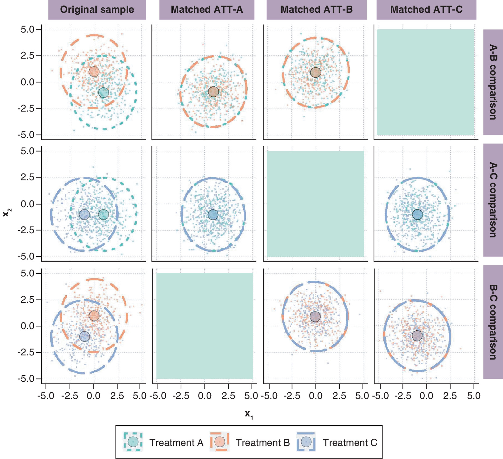
Figure 3. Bivariate ellipses representing the distribution of x1 and x2 before matching (first column) and in the matched sample by target ATT (columns ATT-A, ATT-B and ATT-C) by pairwise treatment comparison in the simulation study.
The larger points with a black outline represent the mean of the bivariate distribution, by treatment. A random sample of individual observations are represented with lighter points. The ellipses represent the 95th percentile of the bivariate distribution of x1 and x2 by treatment based on all individuals. Grayed-out areas are empty because they correspond to an ATT that cannot be targeted for each pairwise treatment comparison.
ATT: Average treatment effect in the treated.
The joy plot in Figure 4 provides an alternative visualization of the impact of matching on target populations by focusing on univariate distributions of x1 and x2 before and after matching for the comparison of treatments A and B. As with the bivariate ellipse plot, we notice how the distributions in the matched sample differ depending on the treatments being compared and the target estimand.

Figure 4. Joy plot for the univariate distributions of x1 and x2 in the original sample and in ATT-A and ATT-B for individuals receiving treatment A (green) or B (orange).
ATT: Average treatment effect in the treated.
Results in Table 1 indicate that estimates for a given treatment comparison greatly differ depending on the target population. For example, when comparing treatment B with C, the estimated ATT is -0.27 when targeting population B and -0.37 when targeting population C. These differences in treatment effect can partially be attributed to estimation error, as the ‘true’ treatment effects were generated as -0.250 (for ATT-B) and -0.375 (for ATT-C).
| Treatment comparison | ATT-A | ATT-B | ATT-C |
|---|---|---|---|
| A vs B | 0.26 (0.04) | 0.48 (0.03) | |
| A vs C | 0.13 (0.03) | 0.36 (0.03) | |
| B vs C | -0.27 (0.03) | -0.37 (0.04) |
ATT-A: Average treatment effect among the population of individuals resembling those who received treatment A; ATT-B: Average treatment effect among the population of individuals resembling those who received B; ATT-C: Average treatment effect among the population of individuals resembling those who received C.
Results from the simulation study demonstrate that treatment effects estimated by pairwise matching should be carefully interpreted. With three treatment comparisons and pairwise matching, there is always at least one of the comparisons that will be targeting a different population than the other two.
Case study in MS
Multiple sclerosis (MS) is a chronic demyelinating disease of the central nervous system characterized by intense disease activity and recovery episodes, eventually leading to progressive disease and disability. With numerous treatments available, researchers are turning to real-world data to simultaneously assess the comparative effectiveness of all available treatments. These analyses often involve PS matching to address confounding bias [12,32–35]. The objective of the case study is to compare the effectiveness of teriflunomide (TERI), dimethyl fumarate (DMF), and natalizumab (NAT) in treating MS. We use the proposed visualization tools to demonstrate how different applications of pairwise matching impact the interpretation of the treatment effect estimates.
Cohort definition & methods
We used data from the Multiple Sclerosis Partners Advancing Technology and Health Solutions (MS PATHS) learning health system, an ongoing collaborative network of 10 healthcare institutions in the US (n = 7) and in European Union (n = 3) [36] which collects standardized clinical and imaging data on patients living with MS.
Our study population consisted of patients who started treatment with TERI, DMF or NAT between November 2015 and February 2022. The outcome of interest was the 1-year change in manual dexterity test (MDT) z-scores, chosen based on exploratory analyses demonstrating that treatment effect heterogeneity may be present. These scores quantify the time to complete the MDT, where higher z-scores correspond to faster times, indicating better performance. We applied pairwise matching and estimated treatment effects as described in the simulation methods using a caliper width of 0.2 standard deviations. See Appendix for more details on the cohort definition, methods, and outcome selection.
Results
We identified 668 patients, of whom 167 initiated TERI (25%), 259 DMF (39%) and 242 NAT (36%). The three treatment groups show some differences in baseline characteristics (Table 2). Figure 5 shows the bivariate distribution of age and disease duration for each treatment comparison in the original sample and for each target ATT. This visualization shows that the treatment cohorts vary in baseline characteristics and that pairwise matching is targeting different target populations. For example, when comparing TERI to DMF (first row), the distribution in the matched sample targeting the ATT in individuals resembling those who received TERI expands toward the upper right of the area, approaching the distribution of patients treated with TERI in the original sample. Similarly, the distribution in the matched sample targeting the ATT in individuals resembling those who received DMF is concentrated in the middle bottom of the area, corresponding to the distribution of patients treated with DMF in the original sample. With the DMF-NAT comparison (last row), the shape of the ellipses after matching are similar regardless of the target ATT because the bivariate distributions in the original sample are already similar.
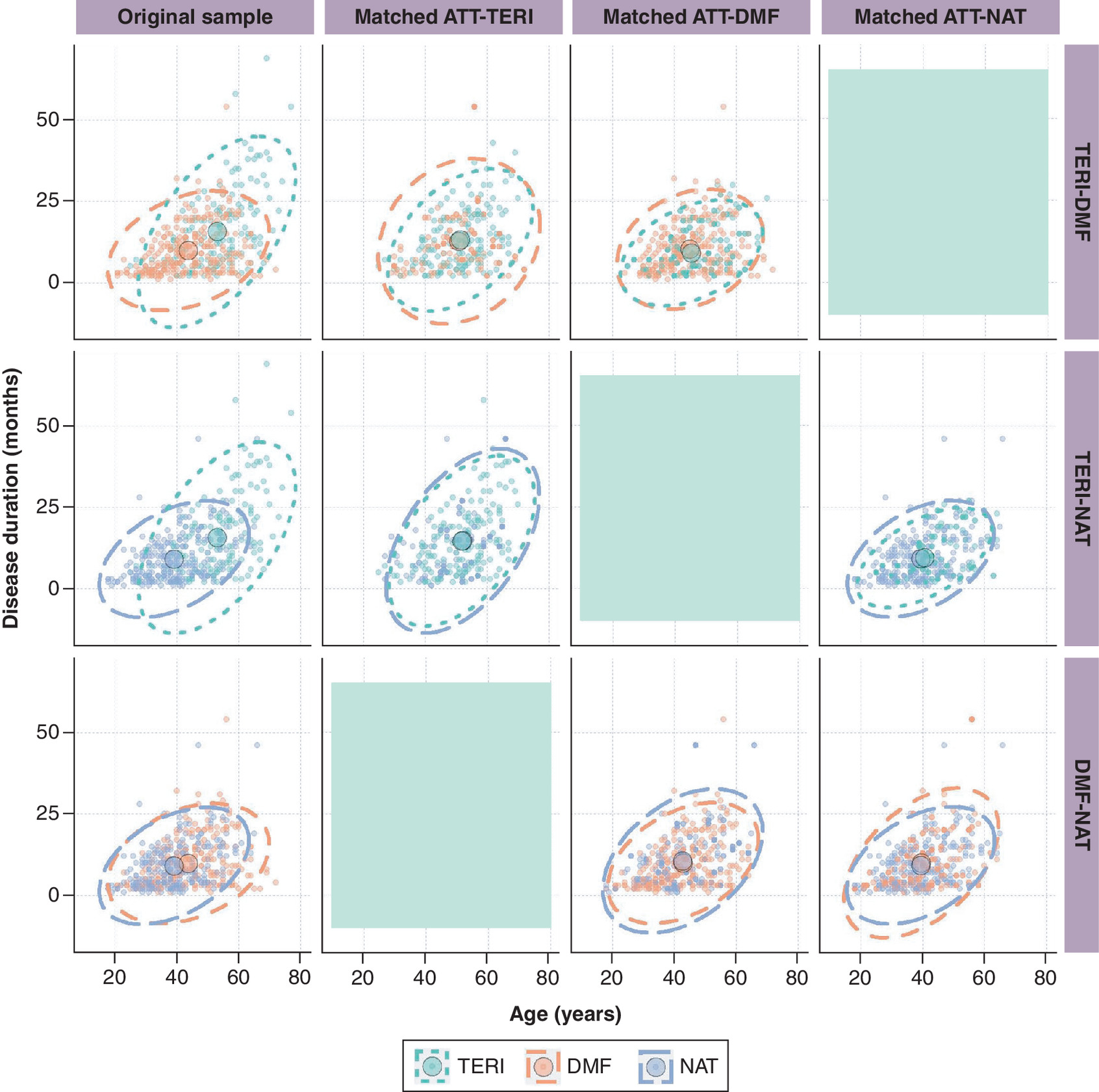
Figure 5. Bivariate ellipses representing the distribution of age and disease duration before matching (first column) and in the matched sample by target ATT (columns ATT-TERI, ATT-DMF, and ATT-NAT) by pairwise treatment comparison in MS PATHS, USA and Europe, 2015–2022.
The larger points with a black outline represent the mean of the bivariate distribution, by treatment. Individuals are represented with smaller points, where points for control individuals selected multiple times in the matched sample are bolder. The ellipses represent the 95th percentile of the bivariate distribution of age and disease duration, by treatment. Grayed-out areas are empty because they correspond to an ATT that cannot be targeted for each pairwise treatment comparison.
ATT: Average treatment effect in the treated; DMF: Dimethyl fumarate; MS PATHS: Multiple Sclerosis Partners Advancing Technology and Health Solutions; NAT: Natalizumab; TERI: Teriflunomide.
| Characteristics | DMF (n = 259) | NAT (n = 242) | TERI (n = 167) |
|---|---|---|---|
| Age (years), mean (SD) | 43.7 (10.5) | 39.1 (9.8) | 53.0 (10.3) |
| Male, n (%) | 47 (18) | 48 (20) | 51 (31) |
| MS duration, years, mean (SD) | 9.9 (7.5) | 8.8 (6.9) | 15.9 (11.9) |
| MS type, n (%) CIS Primary progressive MS Progressive relapsing MS Relapsing-remitting MS Secondary progressive MS | 80 (31) 5 (2) 17 (7) 125 (48) 32 (12) | 59 (24) 7 (3) 21 (9) 128 (53) 27 (11) | 51 (31) 7 (4) 12 (7) 74 (44) 23 (14) |
| Years of education, mean (SD) | 14.1 (3.4) | 14.4 (2.8) | 14.5 (2.8) |
| Relapses in the prior 12 months, n (%) 0 1 2 3+ | 148 (58) 57 (22) 34 (13) 18 (7) | 114 (50) 66 (29) 30 (13) 20 (9) | 104 (65) 32 (20) 10 (6) 13 (8) |
| Efficacy of prior DMT†, n (%) Low Medium High No prior DMT | 102 (39) 15 (6) 6 (2) 136 (53) | 49 (20) 49 (20) 4 (2) 140 (58) | 46 (28) 24 (14) 7 (4) 90 (54) |
| PST z-score‡, mean (SD) | -0.12 (1.20) | -0.27 (1.27) | -0.44 (1.33) |
| CST z-score‡, mean (SD) | -0.35 (1.14) | -0.50 (1.11) | -0.41 (1.00) |
| MDT z-score‡, mean (SD) | 0.05 (1.44) | -0.29 (1.82) | -0.40 (1.66) |
| WST z-score‡, mean (SD) | -0.37 (1.99) | -0.81 (2.83) | -1.03 (2.67) |
| PDDS§, mean (SD) | 1.1 (1.6) | 1.4 (1.7) | 1.9 (2.1) |
†
Low-efficacy DMTs include interferon beta-1a, interferon beta-1b, glatiramer acetate, peginterferon beta-1a. Medium-efficacy DMTs include teriflunomide, fingolimod, mycophenolate mofetil, methotrexate, dimethyl fumarate. High-efficacy DMTs include alemtuzumab, ocrelizumab, natalizumab, rituximab.
‡
For PST, CST, MDT, and WST z-scores, higher scores are better.
§
For PDDS, lower scores are better.
CST: Contrast sensitivity test; CIS: Clinically isolated syndrome; DMF: Dimethyl fumarate; DMT: Disease modifying therapy; MDT: Manual dexterity test; MS: Multiple sclerosis; NAT: Natalizumab; PDDS: Patient determined disease step; PST: Processing speed test; SD: Standard deviation; TERI: Teriflunomide; WST: Walking speed test.
The estimated treatment effect and confidence interval for each treatment comparison are presented for each target ATT in Table 3. Treatment effects are expressed as a mean difference in change in MDT z-scores at 1 year from baseline, where negative values favor the reference treatment (‘ref’) in each comparison. Regardless of the chosen target ATT, the point estimates suggest that DMF and NAT improve manual dexterity at 1 year compared with TERI across all possible target estimands, although the differences are not statistically significant. DMF leads to improved manual dexterity compared with NAT, but the conclusions differ depending on which target estimand is used. Additional results can be found in the Appendix.
| ATT-TERI | ATT-DMF | ATT-NAT | ||||
|---|---|---|---|---|---|---|
| Est. | CI | Est. | CI | Est. | CI | |
| Comparison TERI vs DMF (ref) | -0.10 | -0.82; 0.61 | -0.20 | -0.73; 0.32 | ||
| Comparison TERI vs NAT (ref) | -0.19 | -0.95; 0.57 | -0.01 | -0.60; 0.58 | ||
| Comparison DMF vs NAT (ref) | 0.48 | -0.07; 1.04 | 0.41 | 0.01; 0.82 | ||
A negative estimate favors the reference (ref) treatment.
ATT-TERI: Average treatment effect in the population of individuals resembling those who received TERI; ATT-DMF: Average treatment effect in the population of individuals resembling those who received DMF; ATT-NAT: Average treatment effect in the population of individuals resembling those who received NAT; CI: Confidence interval; DMF: Dimethyl fumarate; Est.: Estimate; NAT: Natalizumab; ref: reference treatment; TERI: Teriflunomide.
Because the estimated ATTs were statistically comparable despite heterogeneity in the underlying populations, the presence of treatment effect heterogeneity does not seem likely. Regardless, this does not mean that we can directly compare all ATT estimates to draw conclusions about the comparative effectiveness of the three treatments, because there is no common population for which all three ATTs can be derived.
Discussion
We proposed bivariate ellipses and joy plots to facilitate the interpretation of target estimands in real-world evidence studies. We showed that estimates of the ATT are not transitive and should not be used for drawing overall comparative effectiveness conclusions when more than two treatments are being compared. This is because ‘treated’ populations targeted by the ATT (usually) differ across treatment comparisons. This situation becomes particularly problematic when the treatment effect varies across patient-level covariates, which is not uncommon for chronic diseases. For example, it is recognized that the clinical course of RRMS is variable and prone to heterogeneous responses to treatment [37].
The recommended visualization tools can be used to identify whether estimates of the ATT are generalizable to the target population [31]. Internal validity can be assessed within each matched sample by inspecting whether covariate distributions sufficiently overlap across the treatment groups. External validity can be assessed by comparing whether covariate distributions sufficiently overlap between the matched samples. A lack of overlap in the latter indicates that the treatment effect estimates are targeting different ATT estimands and that there is no common population to which their results apply. The proposed visualizations also offer an improvement over tabulations of summary statistics of baseline characteristics before and after matching, and could be used to decide upon an appropriate matching algorithm [24,38], or to facilitate the incorporation of external controls in randomized trials or in single-arm studies [23]. While we conducted this research using pairwise matching, the recommended visualizations can be used as diagnostic tools for the target population with other confounding adjustment methods such as weighting or 1:1:1 matching.
The simulation study illustrated the impact of pairwise matching on the comparative effectiveness conclusions when treatment effect heterogeneity is present. In particular, the bivariate ellipse plots showed that at least one treatment comparison is targeting a different population than the other two comparisons. Consequently, treatment effect estimates from the simulation study could not directly be used to infer which treatment is best. The MS case study confirmed that populations to which treatment effects generalize may differ across treatment comparisons. Although there was no apparent impact on the comparative effectiveness conclusions, the visualization tools helped to interpret the estimated treatment effects and to clarify the target population of the estimand.
A limitation of proposed visualization tools is that they consider only two continuous covariates at the time to explore overlap between distributions that are typically multivariate. Extensions of the bivariate ellipses or joy plots (e.g., bar plot, heat map) could be considered for binary, categorical and ordinal variables. Creative arrangements of the bivariate ellipses or joy plots may allow visualizing more than two covariates, for example, by creating bivariate ellipses (two continuous variables) in side-by-side panels based on a categorical covariate (third variable). An alternative approach is to collapse the multivariate covariate space into a univariate summary covariate, such as the propensity score (i.e., the probability of receiving the target treatment) or the disease risk score (i.e., the outcome probability under the target treatment). These two covariates can then be visualized separately (e.g., using joy plots) or together (e.g., using bivariate ellipses).
Another limitation of this research is that the simulation study only considers one scenario with a limited degree of complexity. Estimates and interpretation of the ATT may be affected by the magnitude of the overall treatment effect, as well as the presence and handling of confounders, treatment-effect modifiers, and various sources of bias (e.g., missing data). Further research is needed to assess the implementation of visualization tools in such scenarios.
Conclusion
We recommend researchers to use visualization tools to clarify the target estimand in causal inference studies and interpret the results obtained from matching. The visualization tools may help to enhance the transparency and reproducibility of study findings, and to communicate the applicability of study results to clinicians or prescribers.
Summary points
•
Observational studies often adopt pairwise propensity score matching to estimate the comparative effectiveness of multiple treatments. Corresponding estimates cannot directly be used to draw overall comparative effectiveness conclusions because matched populations are not always interchangeable.
•
We recommend exploring the generalisability of treatment effect estimates by visualizing the target population of the estimand.
•
The internal validity of treatment effect estimates can be evaluated within each matched sample by inspecting the overlap of covariate distributions across the treatment groups.
•
The transitivity (and thus external validity) of treatment effect estimates can be evaluated by inspecting overlap of covariate distributions across the available pairwise comparisons.
•
Researchers should consider reporting bivariate ellipses and joy plots to enhance the transparency and reproducibility of real-world evidence.
Author contributions
G Simoneau, M Mitroiu, F Pellegrini and C de Moor were responsible for study conception and design; author G Simoneau was responsible for acquisition of data; authors TPA Debray, SRW Wijn, and JC Magalhães were responsible for data analysis; authors G Simoneau and M Mitroiu prepared a first draft of the manuscript. All authors reviewed subsequent drafts and assisted in revising the manuscript.
Financial disclosure
This study was sponsored by Biogen. The authors have no other relevant affiliations or financial involvement with any organization or entity with a financial interest in or financial conflict with the subject matter or materials discussed in the manuscript apart from those disclosed.
Competing interests disclosure
M Mitroiu, W Wei, C Shen, F Pellegrini, are employees of Biogen and hold stocks or stock options. At the time of conceiving this manuscript, J Bohn, G Simoneau and C de Moor were employees of Biogen and held stocks or stock options. TPA Debray, SRW Wijn and JC Magalhães received consulting fees from Biogen. The authors have no other competing interests or relevant affiliations with any organization or entity with the subject matter or materials discussed in the manuscript apart from those disclosed.
Writing disclosure
Editorial support for the preparation of this manuscript was provided by Jackie Parker of Excel Scientific Solutions (Fairfield, CT, USA); funding was provided by Biogen.
Data & computing code availability
Individual patient data will not be made publicly available. Code is available on GitHub at https://github.com/smartdata-analysis-and-statistics/visualization-estimands.
Open access
This work is licensed under the Attribution-NonCommercial-NoDerivatives 4.0 Unported License. To view a copy of this license, visit https://creativecommons.org/licenses/by-nc-nd/4.0/
Supplementary Material
File (appendix.docx)
- Download
- 887.58 KB
References
1.
European Medicines Agency. Data Analysis and Real World Interrogation Network (DARWIN EU) (2021). https://www.ema.europa.eu/en/about-us/how-we-work/big-data/data-analysis-real-world-interrogation-network-darwin-eu
2.
United States Food and Drug Administration. Real-World Evidence (2022). https://www.fda.gov/science-research/science-and-research-special-topics/real-world-evidence
3.
Cui ZL, Hess LM, Goodloe R, Faries D. Application and comparison of generalized propensity score matching versus pairwise propensity score matching. J. Comp. Eff. Res. 7(9), 923–934 (2018).
4.
Samuel M, Batomen B, Rouette J et al. Evaluation of propensity score used in cardiovascular research: a cross-sectional survey and guidance document. BMJ Open 10(8), e036961 (2020).
5.
Yao XI, Wang X, Speicher PJ et al. Reporting and guidelines in propensity score analysis: a systematic review of cancer and cancer surgical studies. J. Natl Cancer Inst. 109(8), djw323 (2017).
6.
Stuart EA. Matching methods for causal inference: a review and a look forward. Stat. Sci. 25(1), 1–21 (2010).
7.
Austin PC. A comparison of 12 algorithms for matching on the propensity score. Stat. Med. 33(6), 1057–1069 (2014).
8.
Rosenbaum PR, Rubin DB. The central role of the propensity score in observational studies for causal effects. Biometrika 70(1), 41–55 (1983).
9.
Simoneau G, Pellegrini F, Debray TP et al. Recommendations for the use of propensity score methods in multiple sclerosis research. Mult. Scler. 28(9), 1467–1480 (2022).
10.
Imai K, Van Dyk DA. Causal inference with general treatment regimes: generalizing the propensity score. J. Am. Stat. Assoc. 99(467), 854–866 (2004).
11.
Imbens GW. The role of the propensity score in estimating dose-response functions. Biometrika 87(3), 706–710 (2000).
12.
Kalincik T, Brown JWL, Robertson N et al. Treatment effectiveness of alemtuzumab compared with natalizumab, fingolimod, and interferon beta in relapsing-remitting multiple sclerosis: a cohort study. Lancet Neurol. 16(4), 271–281 (2017).
13.
Lunt M, Solomon D, Rothman K et al. Different methods of balancing covariates leading to different effect estimates in the presence of effect modification. Am. J. Epidemiol. 169(7), 909–917 (2009).
14.
Kahan BC, Cro S, Li F, Harhay MO. Eliminating ambiguous treatment effects using estimands. Am. J. Epidemiol. 192(6), 987–994 (2023).
15.
International Council for Harmonisation of Technical Requirements for Pharmaceuticals for Human Use (ICH). ICH Harmonised Guideline Addendum on Estimands and Sensitivity Analysis in Clinical Trials to the Guideline on Statistical Principles for Clinical Trials E9(R1) (2019). https://database.ich.org/sites/default/files/E9-R1_Step4_Guideline_2019_1203.pdf
16.
Lundberg I, Johnson R, Stewart BM. What is your estimand? Defining the target quantity connects statistical evidence to theory. Am. Sociol Rev. 86(3), 532–565 (2021).
17.
US Food and Drug Administration. E9(R1) Statistical Principles for Clinical Trials: Addendum: Estimands and Sensitivity Analysis in Clinical Trials (2021). https://www.fda.gov/regulatory-information/search-fda-guidance-documents/e9r1-statistical-principles-clinical-trials-addendum-estimands-and-sensitivity-analysis-clinical
18.
European Medicines Agency. ICH E9 (R1) addendum on estimands and sensitivity analysis in clinical trials to the guideline on statistical principles for clinical trials. Report No.: EMA/CHMP/ICH/436221/2017. European Medicines Agency, Amsterdam, The Netherlands (2020).
19.
Luijken K, Van Eekelen R, Gardarsdottir H, Groenwold RHH, Van Geloven N. Tell me what you want, what you really really want: estimands in observational pharmacoepidemiologic comparative effectiveness and safety studies. Pharmacoepidemiol. Drug Saf. 32(8), 863–872 (2023).
20.
Ho M, van der Laan M, Lee H et al. The current landscape in biostatistics of real-world data and evidence: causal inference frameworks for study design and analysis. Stat. Biopharm. Res. 15(1), 43–56 (2021).
21.
Ziemann S, Paetzolt I, Grüßer L, Coburn M, Rossaint R, Kowark A. Poor reporting quality of observational clinical studies comparing treatments of COVID-19 – a retrospective cross-sectional study. BMC Med. Res. Methodol. 22(1), 23 (2022).
22.
Ioannidis JP, Haidich AB, Pappa M et al. Comparison of evidence of treatment effects in randomized and nonrandomized studies. JAMA 286(7), 821–830 (2001).
23.
Lin J, Yu G, Gamalo M. Matching within a hybrid RCT/RWD: framework on associated causal estimands. J. Biopharm. Stat. 33(4), 439–451 (2023).
24.
Lopez MJ, Gutman R. Estimation of causal effects with multiple treatments: a review and new ideas. Stat Sci. 32(3), 432–454 (2017).
25.
Rassen JA, Shelat AA, Franklin JM, Glynn RJ, Solomon DH, Schneeweiss S. Matching by Propensity Score in Cohort Studies with Three Treatment Groups. Epidemiology 24(3), 401–409 (2013).
26.
Yoshida K, Hernández-Díaz S, Solomon DH et al. Matching weights to simultaneously compare three treatment groups: comparison to three-way matching. Epidemiology 28(3), 387–395 (2017).
27.
Li F, Li F. Propensity score weighting for causal inference with multiple treatments. Ann. Appl. Stat. 13(4), 2389–2415 (2019).
28.
Scotina AD, Beaudoin FL, Gutman R. Matching estimators for causal effects of multiple treatments. Stat. Methods Med. Res. 29(4), 1051–1066 (2020).
29.
Scotina AD, Gutman R. Matching algorithms for causal inference with multiple treatments. Stat. Med. 38(17), 3139–3167 (2019).
30.
Sävje F, Higgins MJ, Sekhon JS. Generalized full matching. Polit. Anal. 29(4), 423–447 (2021).
31.
Degtiar I, Rose S. A review of generalizability and transportability. Annu. Rev. Stat. Appl. 10(1), 501–524 (2023).
32.
Karim ME, Pellegrini F, Platt RW, Simoneau G, Rouette J, de Moor C. The use and quality of reporting of propensity score methods in multiple sclerosis literature: a review. Mult. Scler. 28(9), 1317–1323 (2022).
33.
Prosperini L, Saccà F, Cordioli C et al. Real-world effectiveness of natalizumab and fingolimod compared with self-injectable drugs in non-responders and in treatment-naïve patients with multiple sclerosis. J. Neurol. 264(2), 284–294 (2017).
34.
Braune S, Grimm S, van Hövell P et al. Comparative effectiveness of delayed-release dimethyl fumarate versus interferon, glatiramer acetate, teriflunomide, or fingolimod: results from the German NeuroTransData registry. J. Neurol. 265(12), 2980–2992 (2018).
35.
Vollmer BL, Nair K, Sillau S, Corboy JR, Vollmer T, Alvarez E. Rituximab versus natalizumab, fingolimod, and dimethyl fumarate in multiple sclerosis treatment. Ann. Clin. Transl. Neurol. 7(9), 1466–1476 (2020).
36.
Mowry EM, Bermel RA, Williams JR et al. Harnessing real-world data to inform decision-making: Multiple Sclerosis Partners Advancing Technology and Health Solutions (MS PATHS). Front. Neurol. 11, 632 (2020).
37.
Rotstein D, Montalban X. Reaching an evidence-based prognosis for personalized treatment of multiple sclerosis. Nat. Rev. Neurol. 15(5), 287–300 (2019).
38.
Heinz P, Wendel-Garcia PD, Held U. Impact of the matching algorithm on the treatment effect estimate: a neutral comparison study. Biom. J. 66(1), 2100292 (2024).
Information & Authors
Information
Published In
Copyright
© 2024 The Authors. This work is licensed under the Attribution-NonCommercial-NoDerivatives 4.0 Unported License
History
Received: 1 June 2023
Accepted: 3 January 2024
Published online: 23 January 2024
Keywords:
Topics
Authors
Metrics & Citations
Metrics
Article Usage
Article usage data only available from February 2023. Historical article usage data, showing the number of article downloads, is available upon request.
Citations
How to Cite
Visualizing the target estimand in comparative effectiveness studies with multiple treatments. (2024) Journal of Comparative Effectiveness Research. DOI: 10.57264/cer-2023-0089
Export citation
Select the citation format you wish to export for this article or chapter.
Citing Literature
- Peter C. Austin, David E. Austin, The performance of different propensity score methods for estimating the effects of multiple treatments or exposures: a neutral comparison study, BMC Medical Research Methodology, 10.1186/s12874-026-02831-2, (2026).
- John G. Rizk, Giuseppe Lippi, Carl J. Lavie, Beautiful weights, misinterpreted effects: the use and misuse of overlap weighting in major medical journals, 2020–2025, Journal of Clinical Epidemiology, 10.1016/j.jclinepi.2025.112113, 191, (112113), (2026).